Five Dashboard Widgets That Show You Where Your Tokens Go
New widgets for tools per session, cache efficiency, cost by project, token burn, and tools insights help you debug runaway token usage and get more from your AI coding quota.


A developer wakes up on Monday, opens their AI coding tool, and discovers they have already burned 91% of their weekly quota. It is Monday. They have no idea what happened. They paid for extra usage credits the last three weeks running and still cannot explain where the tokens went.
This is not a hypothetical. Kieran Klaassen shared this exact experience last week — and it took another developer writing a custom script to track down the cause. Turned out a recurring script was running every five minutes, silently eating through his allocation. His reaction: “I hope we can make it easier to detect these within Claude and Claude Code soon too.”
We agree. That is why we built five new dashboard widgets designed to answer the questions that token tracking alone cannot: where are tokens going, which projects burn the most, are you using cache effectively, and which sessions are the outliers draining your quota?
The Problem With Raw Token Counts
Most usage dashboards show you a single number: tokens consumed this period. Maybe a line chart trending over time. That is like a credit card statement that shows your monthly total but not where you spent the money.
When your quota disappears faster than expected, you need to break the problem apart. Was it one project or many? Was it main inference or subagent overhead? Were you getting cache hits or re-sending the same context every time? Was there a runaway process firing off sessions you did not know about?
Raw token counts cannot answer any of these questions. The five widgets below can.
Tools per Session
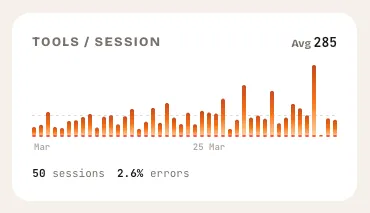
What it shows: A bar chart of tool calls per session over the last 30 days, with error counts overlaid.
This widget answers a question that surprises most developers: how many tool calls is my AI assistant actually making? A session where you ask for a single function might trigger 5 tool calls. A session where you ask for a multi-file refactor might trigger 80. The difference in token cost between those two scenarios is enormous — and invisible unless you measure it.
The average tools-per-session line gives you a baseline. Sessions that spike well above it are worth investigating. Maybe that was a legitimate complex task. Maybe the AI was stuck in a loop, calling the same tool repeatedly and burning tokens on retries.
Error counts matter here too. A session with 40 tool calls and 15 errors is not just expensive — it is wasteful. The AI tried things that failed, retried, and burned tokens on dead-end approaches. If your error rate is climbing, something in your workflow or your prompts needs to change.
What to look for
- Spikes well above the average line. These sessions consumed disproportionate tokens. Hover over them to see what happened.
- Persistent high error counts. Errors cost tokens without producing value. Patterns in errors often point to misconfigured tools or contexts.
- Gradual upward trend. If your average tools-per-session is rising week over week, your sessions are getting more complex — or less efficient. The distinction matters.
Cache Efficiency
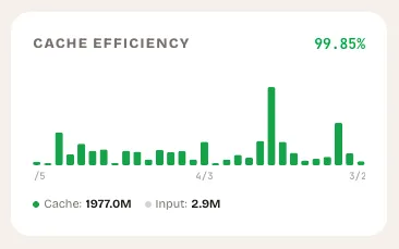
What it shows: A stacked bar chart breaking each day into cache-read tokens (the work you did not pay full price for) and fresh input tokens (the work you did).
Cache efficiency is the single most impactful lever most developers are not tracking. When your AI coding tool reads from cache, it processes previously-seen context at a fraction of the cost. When it does not, you pay full price for the same information every single time.
The widget calculates your overall cache efficiency as a percentage — cache-read tokens divided by total input tokens. It color-codes the result: green above 50%, amber between 20% and 50%, red below 20%.
If your cache efficiency is below 20%, you are essentially paying full price for every session. This often happens when developers start fresh conversations instead of continuing existing ones, when context windows are not configured correctly, or when sessions are too short to benefit from caching.
What to look for
- Days with near-zero green (cache reads). Something changed in your workflow that day. Did you switch projects? Start many short conversations? Wipe your context?
- Consistently low efficiency. If you are below 20% most days, review how you structure sessions. Longer conversations with the same context window cache better.
- Sudden drops. A day where efficiency drops from 60% to 10% is worth investigating. It might be a new project with no cached context, or it might be a workflow issue you can fix.
Cost by Project
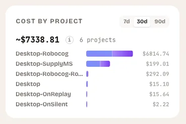
What it shows: A horizontal bar chart ranking your top projects by token consumption, with estimated USD costs and a breakdown of main versus subagent tokens.
This is the widget that would have saved Kieran three weeks of overage charges. A recurring script running every five minutes does not stand out in aggregate token counts. But it stands out immediately when you see one project consuming 10x more tokens than everything else.
Cost by project answers the most basic budgeting question: where is the money going? You can toggle between 7-day, 30-day, and 90-day views to see whether a project’s cost is a one-time spike or a persistent drain. The subagent breakdown (shown in purple) reveals how much of each project’s cost comes from background agent work versus your direct interactions.
What to look for
- One project dominating the chart. If a single project accounts for 70%+ of your total spend, investigate. Is that proportional to the work being done there, or is something running unattended?
- High subagent ratios. A project where subagent tokens dwarf main tokens might indicate automated workflows, agent loops, or background tasks you have forgotten about.
- Projects you do not recognize. If a project name appears that you did not expect, something is running sessions in a directory you are not actively working in. This is exactly the pattern behind Kieran’s runaway script.
Token Burn Tracker
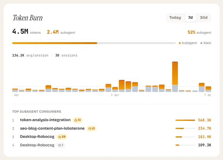
What it shows: A vertical bar chart breaking each session into main tokens and subagent tokens, with red accents on outlier sessions where subagent usage exceeds 70%.
The Token Burn tracker focuses on a specific and growing cost driver: subagent usage. When your AI coding tool spawns subagents to handle parallel tasks — searching files, running tests, exploring code — each subagent consumes its own tokens. A single prompt from you can generate 5x or 10x the token cost if it triggers multiple subagents working in parallel.
This is not inherently bad. Subagents are powerful and often worth the cost. But when they are not, the burn is fast and hard to notice without dedicated tracking.
The widget highlights outlier sessions in red — those where subagent tokens account for more than 70% of the total. It also shows a “top subagent consumers” section listing the most expensive subagent sessions in the period, so you can trace back to what triggered them.
What to look for
- Sessions lit up in red. These are the sessions where subagent overhead dominated. Check whether the outcome justified the cost.
- Rising subagent percentage over time. If subagent tokens are trending from 30% to 60% of your total usage, your workflows are becoming more agent-heavy. Decide whether that is intentional.
- Repeated high-burn sessions at regular intervals. This is the smoking gun for automated tasks. If the same pattern repeats every hour or every five minutes, you have a script or cron job that needs attention.
Tools Insights
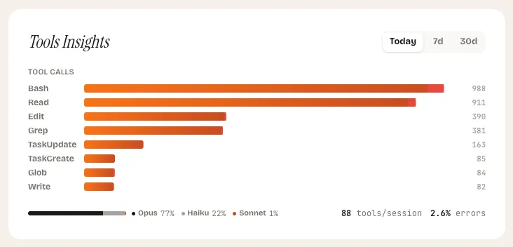
What it shows: A horizontal bar chart of your most-called tools, a model distribution breakdown, and your overall error rate — toggleable between today, 7-day, and 30-day views.
Tools Insights is the diagnostic widget. Where the other four widgets tell you how much you are spending, this one tells you how you are spending it. Which tools does your AI assistant call most frequently? Which model handles your sessions? Where are errors accumulating?
The tool ranking reveals your actual usage patterns. If file-read operations dominate your tool calls, your sessions are context-heavy. If edit operations dominate, you are doing a lot of code generation. If search operations dominate, your sessions are exploration-heavy. None of these is wrong, but each has different cost characteristics.
The model distribution bar shows the split between models across your sessions. Different models have different per-token costs. Seeing that 80% of your tokens are going to a more expensive model when a lighter one would suffice is an immediate optimization opportunity.
What to look for
- Tools with high error counts. A tool that fails frequently is burning tokens on retries. This might indicate a misconfigured development environment, missing permissions, or a tool that does not work well for your use case.
- Model distribution skewed expensive. If most of your tokens flow through the most expensive model, consider whether the tasks justify it. Quick lookups and simple edits rarely need the most capable model.
- Shifts in tool mix over time. Toggle between views to see if your usage patterns are changing. A sudden spike in one tool type might explain a corresponding spike in token costs.
Putting It All Together
These five widgets work as a diagnostic system. When your quota burns faster than expected, start at the top:
- Cost by project — find which project is responsible.
- Token burn — check if subagent overhead is driving the cost.
- Tools per session — see if specific sessions had an unusual number of tool calls.
- Tools insights — identify which tools and models are consuming the most.
- Cache efficiency — check if you are paying full price for context that should be cached.
If Kieran had this sequence available, finding the recurring script would have taken minutes instead of three weeks of frustration and overage charges. The script would have appeared as a single project with abnormally high token consumption, sessions firing at regular five-minute intervals, and likely poor cache efficiency since each short session would re-send the same context.
What Comes Next
These widgets are live in the LobsterOne dashboard today. They update as your Mac app scans your local sessions — no API keys, no code changes, no manual tracking required.
We are actively working on alerts that trigger when these widgets detect anomalies: a project whose cost suddenly doubles, a cache efficiency that drops below a threshold, or a pattern of sessions that looks automated. The goal is to catch issues like Kieran’s before the third week, not after.
See how developers track their AI coding
Explore LobsterOnePierre Sauvignon
Founder
Founder of LobsterOne. Building tools that make AI-assisted development visible, measurable, and fun.
Related Articles

How to Track AI Coding Token Usage Across Your Team
A practical guide to tracking token consumption at individual and team level — what tokens reveal about usage patterns and where value hides.

AI Coding Session Analytics: What to Look For
How session duration, prompt count, and token cost per session reveal developer efficiency and tool-fit signals you can act on.

AI Coding Team Dashboard: What Your Team Analytics Should Show
What a well-designed AI coding analytics dashboard looks like — key views, drill-downs, alert thresholds, and the metrics that actually drive decisions.